Pisces 2010
Pisces: images, pictures, feelings, emotions. Not easily defined but powerful in their impact.
Company image
A logo can add to a company profile in a way that cannot be put into words. A picture can linger in our memory often when we wish it wouldn’t. Who can’t see the Shell logo in their mind’s eye? And who doesn’t know the colour of McDonalds? For companies and products a good logo is vital. Today ‘personal branding’ is seen as important. We need to have the right hair, makeup and clothes to create the image we want to portray. But is this a carbon copy of someone else’s vision or one that is authentic to us?
One of my current projects is to give advice on the house-style for the re-branding of a consultancy company. The company incorporation date is the input for creating a company horoscope, the starting point I use for a discussion on the look and feel of the company and its goal. The horoscope is an excellent tool, as it gives an objective view and fosters useful discussion on a difficult topic. Because everyone has their own ideas and different tastes, it is very difficult to come to a decision when it comes to logos. The horoscope gives a framework to get back to what is really important for the image of the company. And it’s fun!

My business astrology logo
Can you brand a country?
I was delighted to come across a Facebook page this week that takes this even further and is suggesting new branding, (in the form of a flag), for a country. It’s for my homeland, New Zealand. I quote from the website advocating this change: “A Flag is a Brand. New Zealand competes with other countries, cities, and commercial brands. Countries with the strongest, simplest flags tend to have the most cut-through impact. Today, commercial brands command greater recognition than most flags. As an export country competing on the world stage, we need our flag to be strongly competitive from a brand/ symbol/icon point of view.”
This sounds like a job for an astrologer, I thought. So here is free advice for New Zealand! I know a lot of people discard astrology as rubbish. A shame – it is gaining ground in business and really is a great tool. So bear with me if you dare. By giving this as an example, I aim to show you how a horoscope can be used to aid discussion.

My Amsterdam School of Astrology logo
New Zealand becomes a dominion
So we need a date. The dominion dates back to midnight on the 26th September 1907 in Wellington. So we can make a chart. The current flag still incorporates the British heritage. But New Zealand has been self-governing for many years, hence the wish of many for a new image.
I like simple astrology so I tend to start with three things for branding: The zodiac sign of the Sun, the heart of the country: In this case Libra. The sign on the Ascendant – the image or ‘ front door’ of the country: Gemini for NZ. The sign on what astrologers know as the Midheaven, actually the sign above us at birth, associated with where we are headed, our mission or goal and especially our reputation: Aries.
In my view the flag should reflect these three signs. Two are air signs which would suggest shades of blue. Mental energy. Aries is a fire sign and would usually be depicted in fiery red. The current flag with the Union Jack has two of these colours, but doesn’t have the ‘freshness’ of Gemini.
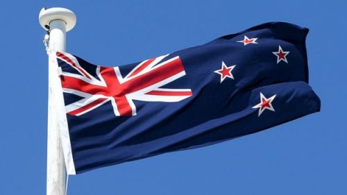
The current flag above also features the Southern Cross – good in terms of air I suppose!
There are some great new fresh designs on Facebook, but none fulfils my ideal flag. So let’s look at my reasoning.
Red:
I think the flag should contain some red. The argument, on the website given below, offers the Silver Fern as a suggestion for a strong image. The reasons are that this is associated with current branding and the All-Blacks rugby team and “The Silver Fern conjures up emotions of grit, guts and genius. It says, “…take on the world and beat it”. These are emotions we need to encourage.” I agree with the sentiment. The mission of NZ should be to compete, to pioneer, to go for it on the world stage and to fight and lead the way on many things. But not just in sport. NZ has a great record of challenging in other areas too, such as nuclear issues. NZ has been first at many things in business and in science. Take Rutherford and the splitting of the atom. Involvement in the invention of the jet boat engine. Note how well NZ has done in the competitive wine industry. The two world wars highlighted many brave NZ citizens who rose to the challenge of defending, another Aries word. So I think it needs to be broader than the Fern. Living outside your own country allows you to see it with different eyes. We are indeed known for our derring-do in sport, bungy jumping and mad adventures in sport, but we should expand this to the business community in the image.
The Blues:
The heart of the country is Libra, which astrologers would associate with different colours – even pink. Some of the flags suggested offer blues and greens to reflect perhaps the beauty of the landscape. Take the example below from Katherine Barnes:

For Libra these are not bad colours. One of the things you hear most about NZ is that it is beautiful and the people are so friendly. So the flag needs to reflect a simple beauty and I think some blue would be appropriate. However as far as an image is concerned, it needs to say more. Libra is about balance and harmony. To my mind a symmetric design would reflect this better. The heart of the country is about being reasonable and fair. It represents debate. A fair fight, fair trade, two sides to everything. Relationships are important. Some of the suggestions refer to the double heritage of Maori and British. I like this idea too for a Libra country. Double images are good. These two designs below cover these points.


The first is by Dan Switzer showing some symmetry (and some red!), the second by Peter Haythornthwaite, who actually says:
- “The two rectangles – one blue and one green, represent: a fresh young country, sky above and the land/sea below. The blue also links to our British heritage, and the green to our environmental responsibilities.
- The long white cloud – the white between the rectangles – recognising the Maori discovery of New Zealand and the name they gave this country, Aotearoa.
- The white ring – represents our aspiration for unity and cohesion between cultures, races and differing views. It also speaks of the desire and need for balance in terms of peoples and environment.”
A lot of Libra in there. But I miss the competitive feel.
Gemini is Turquoise
So the example above on the right scores well here too. It is a bit turquoise.
Gemini is about communication, networking, trade. What I hear from tourists about NZ is that everyone is ready to talk to you. There is always a friendly chat. It is a sociable sign, but how is this reflected in business? When I worked in NZ, I was always amazed at how far ahead we were in the world of communications software. We were often the first to introduce networks in banking and other IT systems. We struggled with being pioneers in what was then known as remote video equipment. But we loved the challenge and were curious enough to ask questions and get answers. There are great networking systems in NZ and international trading, using our worldwide contacts, has always contributed to our income. This freshness, busy-ness, curiosity and sociability has to be in the branding.

So the poor old Kiwi, although he figures in some suggestions- here above from Royal Wakefield – doesn’t fare well in this analysis. Although I love this one below, again from Dan Switzer.

So more turquoise and a bit of red and more work still to be done to satisfy a now homesick astrologer!
Faye Blake-Cossar
Interesting Websites of the Month
For you Kiwi’s on Facebook (or others with a flag fetish), there are interesting discussions on the flag at “Change the NZ flag” and another on “A Measurable Goal for NZ” which suggests defining an ambitious, measurable long term goal for the country. Perhaps a topic for another day. Hmm maybe I need to advise the Dutch government now – they need all the help they can get!
My two logos above were designed by Karin at Datbureau.nl.
Quote of the Month
“An image is not simply a trademark, a design, a slogan or an easily remembered picture. It is a studiously crafted personality profile of an individual, institution, corporation, product or service.”
Daniel J. Boorstin, US historian and writer.
Note on this post in 2016
After a long campaign and a lot of money being spent, NZ decided to keep the old flag. The final choices were not in line with many of these suggestions – maybe they should have taken my advice!


